Barbara Obermeier's Photoshop All-in-One Desk Reference For Dummies has recently been listed on Safari's on-line book service. I know by the title that some may be tempted to buy it. From an artist's standpoint, it's a nice overview of most of Photoshop's features. From a photographer's standpoint, the book seems a bit slanted towards the artist's workflow. For the most part, the book should be seen as a simple overview - and not so much an all-in-one desk reference (like the Photoshop Bibles tend to be).
By way of illustration, turn your attention to page 573 - Introducing the Histogram Palette. "If you are into numbers, check the statistics to evaluate the image as well." Since we're into numbers, lets see where this goes ...
Unfortunately, she doesn't get very deep into the topic. In the break-out box titled "Understanding the histogram statistics," she seems to only reprint the information available in the Photoshop help files. There is no explanation as to how the Histogram works, why it's important, or even that there is an error in the help file's explanation of a certain point (pointed out by a reader to the live help site).

So, let's take a look at the Histogram. In its simplest form, the histogram is a graph. The horizontal axis charts the brightness value. The darkest, black is on the left and white (the brightest) is on right. The vertical axis graphically displays the number of pixels in the image having the brightness value that corresponds to that position on the horizontal axis. OK. So what about the statistics? Here's how the book and the help files explain them (with my comments added):
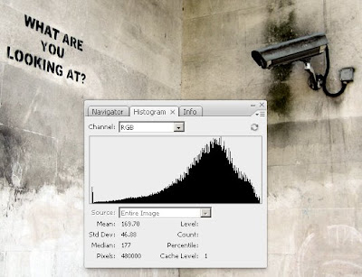
- Mean: Average intensity value (the average brightness value of all pixels)
- Standard Deviation: How much the intensity values vary (how much variation there is in the tonality of the image) (small deviation = steep curve - large deviation = broad curve) (more below)
- Median: Middle value of the intensity value range (the point where half the pixels are darker and half are lighter)
- Pixels: Total number of pixels used to represent (calculate) the histogram
- Cache Level: The current level of image cache used to calculate the histogram (this one is tricky - The original image is Cache Level 1. For each level above 1, four adjacent pixels are averaged to arrive at a single pixel value [notice the warning triangle]. Thus, each cache level has 25% of pixels of the level below it. When Photoshop needs a quick approximation, it uses one of the top levels. Click on the Uncached Refresh button [looks like the recycle arrows] above the warning triangle to redraw the image's histogram using the actual pixels.)
Once we've performed a levels or curves adjustment, the tonality is restored and the graph's peak appears to be more centred. In the first histogram, the Standard Deviation was just above 30. A standard Deviation below 30 often indicates a lack of tonality, just as over 90 indicates extremes in contrast. With our adjustments made, the Standard Deviation is squarely in the middle of the acceptable range of 40-60, indicating a good tonal range.

In the final image, I've placed the cursor in such a spot to find the place from which half the pixels will be lighter and half will be darker (Percentile: 49.51 was as close as I could get). Ordinarily, this place would be Level 128 (0-255), but in our image it's Level 156. This explains the peak's shift to the right of the graph. The Count is a bit misleading. As a comment on the help files page at Adobe illustrates, "the sum of all counts shown in the histogram is not equal to "Pixels" - it is actually equal to 3X the "Pixels". Adobe's page and the Desk Reference fail to note that the count is taken per channel, thus the 3x factor as pointed out by the comment.
And finally a word of warning, Photoshop's Histogram Statistics are designed for 256 levels. With a 16bpc workflow, there may be variations that do not show in the statistics. This problem can be solved rather easily with the free Wide Histogram plug-in from Reindeer Graphics.
To wrap up, having a subscription to O'Reilly's Safari Books is a great way to sample new titles. The monthly subscription price is roughly equal to the price of a single new book per month. I do like to have the printed versions of my favourites, so I use O'Reilly as a screening service; buying the titles I like and saving money by not buying the titles that look good on first glance but lack the depth that I'm looking for. As an example, I just purchased Switching to the Mac: The Missing Manual, Leopard Edition, by David Pogue from Safari to help in the transition from PC to Mac - saving 35% off the cover price in the process.
As far as the Desk Reference goes, it's 4/5 for beginning artists and a 3/5 for everyone else. I do love the cartoons from Rich Tennant. However, in helping us build our storytelling database, really getting in depth, I'm sorry to say that it doesn't even crack the scale.
1 comment:
Jim, another 16 bpc histogram tool can be found here (MS Win only):
www.guillermoluijk.com/software/histogrammar/index.htm
Sincerely,
Stephen Marsh
http://members.ozemail.com.au/~binaryfx/
http://prepression.blogspot.com/
Post a Comment