There are times, as an artist or photographer, that I want to create a certain look and feel with an image - warm, hot, cool, cold, and etc. These types of temperature issues can help set the mood and convey a certain message. Look at the images used in advertising and you'll see what I mean. Look at the colour/temperature/brightness choices of ads for vice related products (tobacco and strong alcoholic beverages for example). The majority of these will use images and colours that convey a "cool" sense, regardless of the colour choice. Johnny Walker's Blue Label is a different blue than LA Dodger Blue. The difference is in the brightness value (HSB). Dial down the brightness of any colour to cool it off.
In Forensic science, numbers are king. Regardless of my monitor's state of repair, or my calibration method, if I sample an image I will be able to determine the RGB values for a particular pixel within Photoshop. Assuming error is not introduced by a lossy compression scheme, these numbers should be able to be reproduced from machine to machine - providing the repeatability necessary in our process.
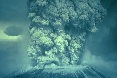
The image above is from the FEMA archives and is displayed on page 14 of Forensic Photoshop. I've provided the link to the image from the source - which is available on the book's web site as well. The image shows Mt. St. Helens errupting. It displays a heavy colour cast. But, with Photoshop, we can get rid of that cast fairly easily. Here's how.
Open a Threshold adjustment layer. Notice the Histogram. Where are the highlights? Where are the shadows? This image is in need of balance.
As you slide the adjustment triangle toward the left, the image turns white. As you move it towards the right, the image turns black. Move it to the left until everything turns white, then back left until the first specs of black start to appear (below).
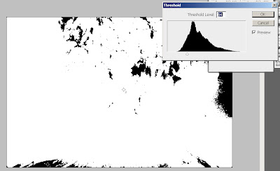
Move the cursor into the image and you'll see that it turns into an eyedropper. Shift+Click on a black area to place a marker in the image and mark your black point.
Go back to the Threshold adjustment and move the slider to the right. Everything will turn black. Move the slider to the left again until specs of white start to appear. Use the cursor again and Shift+Click on a white area to place a marker and mark your white point.
Cancel the adjustment layer.
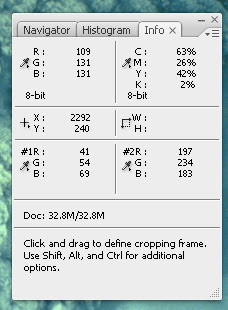
Open the Info Palette.
We now have a sense of what's going on with this image. Point #1 is our black point. It reads R=41, G=54, B=69. There's your blue/green cast. I'd like it to read 8-12 for each value, leaving enough room for detail in the shadows.
For point #2, R=197, G=234, B=183. White=255. I'd like to see the values between 235-245. Again, leaving enough room for detail - this time in the highlights.
Open a Curves adjustment layer. Grab the set black point eyedropper and click on marker #1. Notice the change in the curve. Then select the set white point eyedropper and click on marker #2. This shift will be a bit more dramatic.
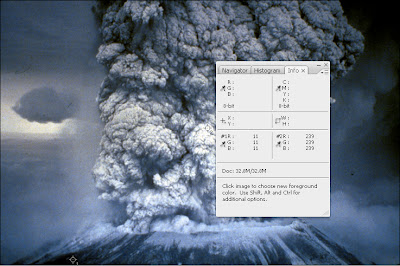
Depending on the sample size of your eyedropper tool, you may still be a little off. Not to worry. Leave the info palette open an use a Color Balance adjustment to dial in the colour - targetting each colour as well as shadows, midtones, and highlights individually.
Thanks again, Kit, for the outstanding comment.
Enjoy.
1 comment:
Super! I had no idea how to use the droppers and markers in curves for anything worthwhile. The light bulb is on now. Thanks for the illumination!
Post a Comment