Featured Post

Welcome to the Forensic Multimedia Analysis blog (formerly the Forensic Photoshop blog). With the latest developments in the analysis of m...

Monday, March 30, 2009

Helpful Guides


"What did I do? What am I looking at? It looks like someone put a screen door over my image. How do I get this to go away?"

It's an interesting question with a simple answer.

You're looking at a
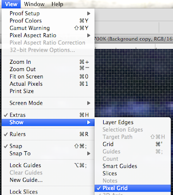
Pixel Grid. The Pixel Grid appears in magnifications above 500% and is enabled by default on systems that support the OpenGL acceleration.

To control the viewing of this grid, go to View>Show>Pixel Grid.


How does the grid help us? You can use the grid to assist in making precise adjustments to your masks or in getting your coordinate descriptions just right.

Sunday, March 29, 2009

Opera anyone?

I was testing web services for a client who uses Opera. I'd heard of Opera but never tried it ... until today. Believe me, I've tried most browsers and all of the major ones. Guess what? Opera is my new best friend. Click on the banner below to find out more.

Opera, the fastest and most beautiful browser on the planet. download now

Enjoy.

Preference for originals?

California has a unique exception to the "Best Evidence Rule." California Evidence Code Section 1521 states:

1521. (a) The content of a writing may be proved by otherwise admissible secondary evidence. The court shall exclude secondary evidence of the content of writing if the court determines either of the following:
(1) A genuine dispute exists concerning material terms of the writing and justice requires the exclusion.
(2) Admission of the secondary evidence would be unfair.
(b) Nothing in this section makes admissible oral testimony to prove the content of a writing if the testimony is inadmissible under Section 1523 (oral testimony of the content of a writing).
(c) Nothing in this section excuses compliance with Section 1401 (authentication).
(d) This section shall be known as the "Secondary Evidence Rule."

Here's the reference to 1401:

1400. Authentication of a writing means (a) the introduction of evidence sufficient to sustain a finding that it is the writing that the proponent of the evidence claims it is or (b) the establishment of such facts by any other means provided by law.

1401. (a) Authentication of a writing is required before it may be received in evidence.
(b) Authentication of a writing is required before secondary evidence of its content may be received in evidence.

1402. The party producing a writing as genuine which has been altered, or appears to have been altered, after its execution, in a part material to the question in dispute, must account for the alteration or appearance thereof. He may show that the alteration was made by another, without his concurrence, or was made with the consent of the parties affected by it, or otherwise properly or innocently made, or that the alteration did not change the meaning or language of the instrument. If he does that, he may give the writing in evidence, but not otherwise.

The problem here lies in the fact that the success or failure of a challenge based on these areas of the evidence code depends entirely upon the judge. Also, finding evidence of success or failure in challenging based on these is really tough as these challenges don't often make the headlines or swing entire cases.

Perceptual Rendering Intent

A reader asks, "what's the best way to get my large photos looking good on a low-end ink-jet printer."


The problem lies in squeezing your beautiful work into a small gamut. Try these settings, found in Edit>Convert to Profile. Your printer should be able to handle the sRGB space, and the Perceptual Rendering Intent will help ease your image into that space.

In the war between absolute colour fidelity and the relationship between similar colors, Perceptual sides with the relationship and does its best to preserve the "look and feel" of the image at the expense of the raw colour numbers.

Use these settings and produce a test print. Chances are, this method will help you produce the best images possible out of a lower end printer.

Saturday, March 28, 2009

Share My Screen

One helpful resource that's now built into Photoshop is Share My Screen. I've been able to help readers solve their photoshop problems with this FREE service (up to 3 connections are free).


To activate the feature, you'll need an Adobe ID and a small plug-in. You'll also want a speedy connection to the internet.

From there, you can share your screen and have a dialog about what's going on. Use the comments section to collaborate, ask questions, guide steps, and so forth.

Use this handy free feature to show your work to clients, attorneys, family members, or whoever. Once you get used to it, you'll wonder what you did without it.

Photoshop CS4 ACE Exam Announced

Adobe recently made available the Adobe Certified Expert exam for Photoshop CS4. Along side of this, our good friend at ExamAids has produced yet another brilliant aid for the Photoshop CS4 test. The ExamAids test preps remain the premier products for helping prepare you for Adobe ACE exams.

Friday, March 27, 2009

Gaussian?

"I looked up gaussian on the net. All I could find out about it had to do with statistics and bell curves. What gives? How am I supposed to answer questions about Photoshop if I can't find the info on basic functions like this?" - an anonymous comment

At the risk of insulting the physics and stats pros out there, simply put "gaussian" refers to the bell-shaped curve that Photoshop uses for its internal calculations when applying weighted averages to pixels.

For more info, check out any one of Dr. John Russ' books on imaging.

Memory Question

A reader writes about using the Duplicate command on a large image, and having his Windows computer abruptly crash.


The key to unravelling this mystery is in how the Duplicate command works. Image>Duplicate loads a copy of the image, layers and all, into memory. It doesn't spit it out on to your disk, as such, until you save the copy.


So, if you are working on a large layered file, you'll need check to make sure that you have enough memory, an external speedy scratch disk, or other such aid to assist you in duplicating an image.

What did I click?


What did I click? How did I get this menu? How do I get it back?

Looks like you found one of Photoshop's hidden gems. It's a handy feature available from the status bar in Windows, or the bottom of the document in MacOS. With it, you can choose from a number of display options.
  • Version Cue lets you know if the document is managed or unmanaged.
  • Document Sizes lets you know the size (in MB) of the document.
  • Document Profile lists the current profile, eg. ProPhotoRGB.
  • Document Dimensions lists the pixels X, pixels Y, and the PPI.
  • Measurement Scale shows 1 pixel = ? for your document.
  • Scratch Sizes lists how big the file is currently/how much space is left to work in.
  • Efficiency lists how efficiently Photoshop is using the available resources. If the figure drops below 100%, Photoshop is using the scratch disks.
  • Timing lets you know how long your last task took and at what efficiency Photoshop performed.
  • Current tool lists the currently loaded tool.
  • 32-bit exposure loads an exposure slider (32-bit mode only).

Thursday, March 26, 2009

Qui custodiet ipsos custodes?

Qui custodiet ipsos custodes?

The answer to this age old question rests here.

Remember, look up, look around ... cameras don't discriminate.

Configurator download ready

The Forensic Photoshop Workflow Configurator Panel been posted to the Book's Resources secure site page this morning. If you plan on using it on a machine without internet access, you'll notice that the header graphic does not display. The header graphic resides on the web site. If you want, you can download the header and use Configurator to re-link it to where it resides on your hard drive.

Wednesday, March 25, 2009

Configurator Update

I know that I promised a Configurator panel to help with the Workflow. I've been working on it and it has finished the initial beta tests with a selected group of readers. It'll be loaded up on the Book's secure site as a free download by week's end.

In the mean time, here's a brief tease of what's in store ...


Version 1 of the panel will feature the first 5 steps of the Workflow and will serve to get you started - a kind of simplified check-list.

Book owners can find this free download on the secure site. I've also included the actions as a separate download, so make sure to get them both. Just one of the many benefits of owning a copy of the book.

In future posts, I'll show you how to load the actions and the panel into Photoshop CS4.

Configurator in action


Here's a little teaser video to get you thinking. Obviously, much of the workflow has been reduced here to help speed the download time of the video.

Remember, the download will be free for owners of the book. To get your copy, and the handy configurator panel, click here.

Selections - Pt. 1


One question that comes up when using the Magic Wand tool is, "what do those pesky options mean?" Specifically, people get confused about Contiguous and what it does.

When it's selected, only the pixels that have the same colour value as the targeted area get selected. If it's not selected, then all pixels that have the same colour value are selected - no matter if they are interconnected or not.

It's really just an additional level of control for your Magic Wand tool.

Selections - Pt. 2


Another useful tool for making selections is the Magnetic Lasso tool. When this one was introduced, it quickly became one of my favourites. I like it most because it seemingly snaps to the edge detail within an image, allowing me to select objects with ease. How does it work so well? Here's the secret to using the tool effectively.

It all has to do with edges.

What are edges? Edges are differences in contrast. (This is also how sharpening works - driving edge detail away from each other ...) You can use the Contrast box to help Photoshop determine if the edge will be included in calculating the path of the Lasso. So it's really important to pay attention to this adjustment, especially if you are trying to get a selection out of some subtle detail.

If you are using the Magnetic Lasso tool, and your paths look jagged or don't seem to be following the line that you see in the image ... make the adjustment in the Contrast box. A little fine tuning goes a long way towards great results.

Tuesday, March 24, 2009

Collections

When presenting, or when you are trying to stay organised, gathering your images together in one handy place is important. When conducting a briefing on a certain crime wave, you may have images on several different places in your hard drive. You want to organise them, but creating massive sets of duplicates is simply not practical, even with drive prices so low. So what do you do?

Collections and Smart Collections


Part of the brilliance of Bridge as a organisational browser - Collections help you group items together, without having to move them around on your drives or create copies.


You find Collections with it's own tab and panel in Bridge. The icons at the bottom of the panel allow you to either create a Collection or a Smart Collection.

Create a new collection using the left most button. Rename it. Then, as you find items to include, simply drag them to the icon. It's really that simple. You can even create Smart Collections from a saved search result.

Check it out for yourself. I'm sure that you'll find it just as helpful as I do.

Monday, March 23, 2009

Bit depth

I'm back from the NATIA conference and will (hopefully) get to everyone's e-mails.

The term "bit depth" is used to describe the number of possible colour values a pixel can have. This concept confuses some folks and I tend to get a quite a few questions from folks who have trouble grasping this rather obscure topic.

Here's a way of thinking about it:

Bit depth = 1
Two possible values: black/white

Bit depth = 8
2 to the 8th power = 256

When you come across a different bit depth, think 2 to the power of the number of bits and you'll have an easy way of figuring out the number of possible values.

Here's a quick quiz. How many possible colour values for a bit depth of 12? Now, how many for 12 bits per channel RGB? If you are shooting in RAW, and your images are 12-14 bpc - would you want to try to cram that info into an 8bpc RGB image out of the gate? Most assign the image a 16 bpc working space in ACR and give the image some head room.

Composite Channels

A reader was a bit confused by my response to a channel question, in which I referred to an image in RGB mode as having 4 channels.


There are, of course, the Red-Green-Blue channels as shown above. There is also a composite channel (RGB) which is used to display the image. The composite counts as a channel as well.

LAB has four total channels, CMYK has five, and Grayscale has but one.

Calibration Bars


Calibration Bars is one of the options found in the Output submenu of the Print dialog box. When you check this box, Photoshop prints an 11-step grayscale wedge that contains a transition in density from 0-100% in 10% slices.

A reader had a bit of trouble with this. He wanted the bars on the image. But they weren't showing up. He thought that there was something wrong with Photoshop. Not to worry. The Calibration Bars will only print if the paper size is larger than the printed dimensions of the image, which is why it wouldn't work whilst printing "full bleed" images.

Monday, March 16, 2009

IR question answered

A reader writes in asking why shots done in IR seem to extend to much greater depths. The answer has to do with the dust and moisture in the air absorbing more of the shorter wave visible light, and less of the longer wave infrared light. This is also why you see less of the airborne stuff in your IR images.

"The longer waves of the infrared spectrum diffuse less than the shorter visible waves. As a consequence, distant objects will reproduce with more clarity and sharpness. This can be an important factor, especially in landscape and aerial photography," says noted IR photographer and author Cyrill Harnischmacher.

Want to see some IR photos from yours truly? Check me out on Facebook. Make sure to mention the blog in your friend request.

Enjoy.

Photoshop CS4 Photographer's Handbook

Sitting in the airport, you get a lot of time to wait. Thankfully, a copy of Photoshop CS4 Photographer's Handbook arrived in my mailbox on Friday.

One of the things that I like about this book is that each suggestion, each lesson is taken step-by-step. It's easy to follow along with the author's thought process. The other thing that I like about this book is that it doesn't assume that the reader is already a Photoshop pro. The author takes you through setting up Photoshop, Bridge, and Lightroom (yes, even Lightroom is included). Then you move into some imaging fundamentals ... then it's off to work on images.

It's a delightful book and well worth the read. As such, I highly recommend it.

Friday, March 13, 2009

Version Cue

In previous posts and in class, I've mentioned that I choose not to install Version Cue. I've given reasons like working alone and the fact that its a bit of a resource hog. A reader wrote in to point out some of the benefits available to solo workers (and everyone for that matter), so I'll happily pass them along.
  • helps manage different versions of a file
  • helps maintain the file's history
  • helps in file security
  • helps back-up and restore entire projects
All of these are cool features, but they come at a cost. There's the aforementioned resource issue. There's also the discovery issue. If you've made different versions of a file, why ... where are they ... and are they all discoverable? If you activate the History Log, is that file discoverable? Do you want it to be?

These are all issues brought up when using a creative tool in forensic work. Not everything is appropriate for our use. New software needs to be validated and checked against your agency's SOPs and applicable law before being put into play with case work.

Gamut Warning?

"What's Gamut Warning and is it important to me?" writes a reader.


It's important when you go to print. If your printer can't output the colours that are present in the image then you may be in a bit of a bind. Turning on the
Gamut Warning (View>Gamut Warning) will help by giving you a visual reference (on screen) - providing a colour overlay on the problem areas. You can then fine tune these areas to "bring them into Gamut."

It can be a bit of a distraction to leave it on all the time, so you may want to save it for when you are about to print.

Thursday, March 12, 2009

Acrobat 9 updated

Acrobat 9.1 update is available and I suggest that everyone get it installed soon.

"Product updates for Adobe Reader and Acrobat 9 that patch the recent security vulnerability are immediately available for download. They are currently available for Windows and Macintosh and several language versions. This updates the products to version 9.1."

For more information and to download the updater, please read the tech note: Link to the tech note.

Application Frame?

I've been trying to catch up on reader mail. A reader happened to be on a friend's Mac and noticed an interesting menu item. It being his friend's computer, and him not wanting to "blow s#%t up," as he put it, he left it alone. But he still was curious.

Application Frame is found towards the bottom of the Window menu in Mac OS.


When selected and stretched out to fill the screen, it simply hides the desktop and provides a more "Windows-like" view.


The Application bar gets included in the window and can't be hidden. You can drag the whole package around the desktop if you like. It's interesting and may help you stay organised when working with multiple programs at once. It's one of those things that there, and you may find it useful, or you may not. But ... you'll never know until you try.

High Pass Filter


One of the comments on Chris' post on HDR had to do with the filters that were mentioned. Chris "the science guy" Russ often throws out terms thinking that everyone is one the same page. Unfortunately, some of us aren't even in the same book. :-)

Side note: the picture shown above was taken by an arson investigator. It was processed using the technique described by Chris yesterday and the results are shown below.


Back to the question ... the question had to do with High Pass - where does the name come from? Many folks use High Pass. Others are confused by the name and leave it alone. Some worry that it might not work as a sharpener as it's not found in the Sharpen sub menu, it's found in Filter>Other. So what's with the name?


High Pass removes low-frequency detail whilst preserving edge detail in areas that contain sharp colour transitions. In other words, it lets the high frequencies pass through and stops the low frequencies. Yes, it's really that simple.


As far as the arson image goes, you can notice the richness of the colours and the enhanced contrast. All of this comes from within the single image using Chris' technique.

Kuler?

A reader wrote in to ask about Kuler and its role in Photoshop.

Kuler is a panel that's used to store groups of colours and themes. These colours and themes can either be created and stored by you, the user, or by "the online community of designers."


Window>Extensions>Kuler


So, where would you use it? In creating flyers for that retirement party or other office function. It's just a fun little add-on to help spark your creativity.

Wednesday, March 11, 2009

Poor man's HDR compression

Today, I'm turning over the blog to Chris Russ from Ocean Systems. I had a blast teaching with him at last year's LEVA training conference. The "Evans and Novak" dynamic was fun - science meets art geek, moving from FFT to painting away noise.

HDR has been a hot topic lately, but it's often difficult for us to take advantage of this technique. We don't usually get to compose shots or bracket exposures ... and etc. We get what we are given and make the best of it. With that in mind, Chris has penned a unique look at HDR that I know you'll enjoy. Here it is:

Poor Man's HDR Compression
by Chris Russ, Ocean Systems

HDR Compression (or High Dynamic Range Image Compression) is a method of making the difference between the brightest areas and the darkest areas in the image less different but in a visually believable way. There are many approaches to this, but many of those approaches leave the image looking “grungy” or artificial in some way.

This method is much more subtle in how it works and can be used in both 16-bit and 32-bit modes within Photoshop. It also yields images that tend to be much more normal looking to the Human eye.

Photoshopʼs Gaussian functions (and the things based upon it like UnSharp Mask and High Pass) are limited to a radius of 250 pixels. This is all well and good, but sometimes having a larger radius allows a much better treatment of gradients in images, and further hides the “halo” effect of Gaussian-based processing.

Here is a method of adding in a High Pass (which is what Adobeʼs unsharp mask happens to be) using layers.

First, promote the image to 16 bit-per-channel mode (or even 32-bit mode in Extended). Then either duplicate the background layer or stamp visible (Cmd-Opt-Shift-E on the Mac) to create a new copy of the present image on top of the layer stack.

Perform a radius 250 Gaussian Blur on it. Three times. This is the equivalent, not of radius 750, but of about 430. Get larger amounts by continuing to apply the Gaussian Blur, but there is a point of diminishing returns.

Now, Invert this layer. It should look like a blurred out mess.

Desaturate this layer. Now it should look like a gray blurred out mess.

Almost done, change the layer blend mode to
Luminocity and the Opacity to 20-25%. This
will produce a “flattened” image. (Max is about 45%.)

Finally, put in a
Levels adjustment layer on top and set the blackpoint, gamma, and whitepoint as desired. This effectively flattens the gross dynamic range of the image (which a normal High Pass does) while at the same time permits more of the brightness range in the histogram for image details.

If there have been big brightness changes, it may be necessary to adjust the saturation in the image (a Hue/Saturation adjustment layer can be good for that). As a rule of thumb, areas that get darker appear more saturated and areas that get brighter appear less saturated when there are brightness changes.
Tuesday, March 10, 2009

Art Walk LA

Don't forget to check out Art Walk LA this Thursday evening. Remember, Metropolis Books is featuring local photographer Jack Nadelle.

Tour stops

The road show is on again. Tour stops are scheduled for Hesperia, Ca. on Friday and the Denver, Co. area next week. InterMountain NATIA members should check with their chapter officers to get in on the training.

Thursday, March 5, 2009

Codec problems?

I received a call the other day from a deputy who was having codec issues. It seemed that Premiere Pro was the only program that could work with a particular AVI file, but he wasn't all that proficient in Premiere Pro. He was looking for an answer as to why Premiere would work with a file and his other programs wouldn't. He was also looking to see if he could somehow convert the file for use in his preferred program.

Sure. No problem. Let's see how this could work.

If Premiere Pro can handle the file, then chances are the computer has the necessary "Direct Show" codecs installed. If this is the case, then VirtualDub should be able to handle it as well. VirtualDub is not an editor like Premiere Pro, but it does work really well at stripping codecs and making an AVI easier to work with (using the "standard" Microsoft codec). Version 1.8.8 is the current stable build.

Once stripped, or saved as a "generic" AVI file, the file can be read in most editors.

The best news of all ... VirtualDub is free, though donations are appreciated by the programmer.

Interesting reading

This just in, courtesy of Doktor Jon:


"Two broad types of surveillance can be distinguished: mass surveillance and targeted surveillance. Mass surveillance is also known as “passive” or “undirected” surveillance. (JUSTICE, p 109, note 20) It is not targeted on any particular individual but gathers images and information for possible future use. CCTV and databases are examples of mass surveillance.

Targeted surveillance is surveillance directed at particular individuals and can involve the use of specific powers by authorised public agencies. Targeted surveillance can be carried out overtly or covertly, and can involve human agents. Under the Regulation of Investigatory Powers Act 2000 (RIPA), targeted covert surveillance is “directed” if it is carried out for a specific investigation or operation. By comparison, if it is carried out on designated premises or on a vehicle, it is “intrusive” surveillance. Targeting methods include the interception of communications, the use of communications “traffic” data, visual surveillance devices, and devices that sense movement, objects or persons."

Little Brother?
Getting the balance right on surveillance powers

"Surveillance has been a topic covered by Select Committees in both the House of Commons and House of Lords in the past year. In 2005 the Surveillance Studies Network published a report for the Information Commissioner terming the UK a ‘Surveillance Society’. Following this, the House of Commons Home Affairs Select Committee launched an inquiry and published their findings in ‘A Surveillance Society?’ in June 2008. The House of Lords Constitution Committee has also recently published the results of its inquiry into surveillance powers and recommended that there should be a public consultation on the levels of authorisation required for different surveillance activities."